✅ Acceptance Criteria
- The date-picker component should have a 2px navy-blue border.
  - The header of the date-picker should include:
    - Previous Month ("<")
    - Current Month (Capitalized)
    - Next Month (">")
  - The sub-heading of the date-picker should have:
    - Current year
      - Clicking the year should prompt a year-picker modal
🧪 Test Results
When testing against acceptance criteria, QA should use emojis to denote results and supply screenshots "scrot", videos and context with the following annotations:
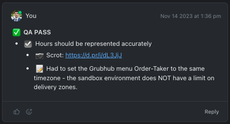
- ✅ QA PASS
- All acceptance criteria passes in the entire task (with possible punts).
- 🛑 QA FAIL
- At least one acceptance criterion failed.
- ☑️ (PASS)
- Requirement Passes (tree-dependent)
- ❌ (FAIL)
- Requirement Fails (parent-independent)
- 👍 (Acceptable)
- When a requirement is met "close enough" to be acceptable.
- This could mean the requirement was arguably out of scope and had not been fully refined but was still necessary. In the interest of avoiding blockers, a placeholder function or design is implemented in lieu of something better.
- When a requirement is met "close enough" to be acceptable.
- ❓(Question)
- When a behavior or design inside of the task scope is unfamiliar or has not been explained and you want to make a note to ask about it later.
- 📷 Scrot: https://link-to-image.png
- It is best to ensure the screenshot provides enough context and annotations (arrows, boxes, text) such that it is clear to the developer.
- 🎥 Video: https://link-to-video.mp4
- It is best to keep videos as short and concise as possible. Sometimes a long video is unavoidable but more often than not, longer videos make it more difficult to tell what the focal point or behavior shown could be.
- 📝 (context):
- An opportunity to describe what was experienced while testing the requirement
- May describe how the functionality differed from what was expected and any other contextual issues that may or may not be in scope.
- May also describe how to replicate the behavior, good or bad.
- "Notes" can be as long and descriptive as needed to convey the issue or behavior appropriately and ensure the developer knows what is happening, good or bad.
- An opportunity to describe what was experienced while testing the requirement
- ⚠️ (possibly out of scope): describe some confusion in the functionality or design that may have not been described fully in the acceptance criteria.
- Examples include:
- Missing designs that were implemented as a "best guess" by the developer.
- Functionality that performed in an unexpected manner also not described in acceptance criteria.
- Any assumed bugs out of scope
- Examples include:
- 🏈 (PUNT)
- Describes a new bug that should be in a new task.
- Bug found in scope but unexpected - therefore needing refinement and a new task.
- Bug found out of scope but not documented in any other task
- This bug can be included in a separate existing task - include the link to that task
- Bug found out of scope but already documented in another task - then provide the link to the task where this bug is included
- Describes a new bug that should be in a new task.

:stop_sign: **QA FAIL**
- :ballot_box_with_check: The date-picker component should have a 2px navy-blue border.
  - :camera: Scrot: https://screenshot-of-component.png
- :x: The header of the date-picker should include:
  - :memo: Not all child requirements passed, therefore this failed.
  - :ballot_box_with_check: Previous Month ("<")
  - :ballot_box_with_check: Current Month (Capitalized)
  - :x: Next Month (">")
    - :warning: Double clicking the Next Month Icon goes 3 months forward instead of 2.
- :ballot_box_with_check: The sub-heading of the date-picker should have:
  - :ballot_box_with_check: Current year
    - :ballot_box_with_check: Clicking the year should prompt a year-picker modal
      - :movie_camera: Video: https://video-of-prompt.mp4
    - :football: Clicking on Year will only give the user 2 possible future years, should provide at least 10.
